Statistical Graphs, Charts, Tables, Percentages, Percentile
EXAMPLE 3.1.1
The bar graph below shows the results of a survey in which a number of dogs were asked "What is your favorite food?" No dog gave multiple answers.
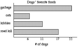
What percent of dogs said that their favorite food was cats?
A. 6%
B. 17%
C. 11%
D. 30%
EXAMPLE 3.1.1 SOLUTION
First, we find the number of dogs who responded to the survey.
We do this by recognizing that the numbers on the horizontal
axis tell how many dogs gave each of the four responses.
If we add those four numbers, we have the total number of dogs who responded:
6 + 11 + 17 + 22 = 56
There were 56 dogs who responded to the survey
(we say that in this survey the sample size or sample population is 56,
or simply that n = 56).
Now we read the graph and see that 6 of the 56 dogs gave the response "cats."
Thus, we need to find the percentage that corresponds to "6 out of 56."
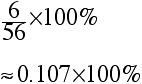
To do this, we divide 6 by 56, and then multiply by 100%.
The best choice is C.
Notice that when we "multiply 0.107 by 100%" what we actually do is
move the decimal point two places to the right, and append a "%" sign.
FACT: To convert a decimal number to a percent, we move the decimal point two
positions to the right, and add a percentage sign.
EXAMPLE 3.1.2
The graph below shows the distribution according to academic major of a group of students.
None of them have double majors.
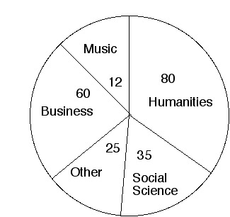
A. 25%
B. 12%
C. 88%
D. 94%
see solution
EXAMPLE 3.1.3
The graph below shows the percentage distribution of grades on an exam.
Assuming that 828 people took the test, how many received
grades of A or B?
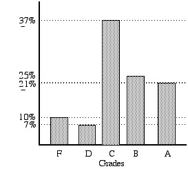
see solution
EXAMPLE 3.1.4
The graph below shows information about US households over the period of time
beginning in 1910 and ending in 1990.
Suppose that the US population in 1990 was roughly 270 million.
How many people were classified as "rural."
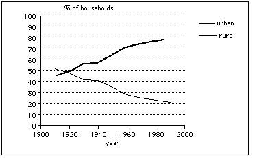
see solution
EXAMPLE 3.1.5
The graph below shows the projected assets of the Social Security Trust Fund
over the period of time beginning in 1997 and ending in 2032.
Based on these projections, decide whether each statement is true or false.
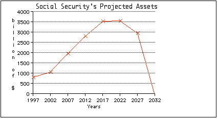
A. The assets will be non-negative over the entire period of time.
B. The assets will be increasing over the entire period of time.
C. Over the period of time from 2022 to 2027, the Social Security Trust Fund will be in debt.
D. Over the period from 2007 to 2032 the assets will decrease by about $2000 billion.
see solution
SCATTER DIAGRAMS
A scatter diagram is a plot that uses a number of individual cases to display
the relationship between two variable quantities.
EXAMPLE 3.1.6
The scatter diagram below shows the relationship between the number of absences from
lecture and the Unit 1 test score for students in one section of
Liberal Arts Mathematics during spring semester, 1999.
Determine whether each of the statements given below is true or false.
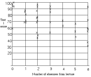
1. The students with the two lowest scores had the greatest number of absences. True or false?
2. Increased numbers of absences are always associated with lower test scores. True or false?
3. Among students with at least 4 absences, the highest test score was about 70. True or false?
4. Students who had zero absences tended to do better than the other students. True or false?
5. Skipping class causes students to get lower test scores. True or false?
6. Among students with fewer than 2 absences, only one failed to get a test score of at least 60%. True or false?
see solution
EXAMPLE 3.1.7
This graph shows the relationship between high school GPA and college GPA for a certain group of students.
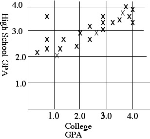
Select the statement that is correct, according to the data shown.
A. Higher high school GPAs tend to be associated with higher college GPAs.
B. Higher college GPAs tend to be associated with lower high school GPAs.
C. Higher high school GPAs cause higher college GPAs.
D. There is no apparent association between college GPA and high school GPA.
see solution
MISLEADING GRAPHS
EXAMPLE 3.1.8
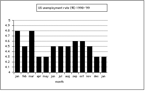
The graph below shows the US unemployment rate (as a percentage) on a
month-by-month basis over the period of time beginning in January 1998 and ending in
January 1999.
True or false: The unemployment rate in September 1998 was roughly twice as
great as the unemployment rate in May 1998.
EXAMPLE 3.1.8 SOLUTION
The statement is false. Although the column above "sep" appears twice as high as the column above "may,"
the visual depiction is misleading due to the fact that numbers on the vertical axis begin at 4,
rather than at 0. In other words, this graph is incomplete: it is only showing us the "treetops"
rather than showing the whole forest. The complete graph, drawn to scale, looks like this:
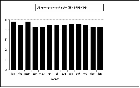
As this graph shows, there is relatively little difference between the unemployment rates in the two months. The misleading graph that was used first did not show the whole picture, and hence the differences were greatly exaggerated. This kind of distortion is not unusual; it is frequently employed be people who are trying to use statistics to convey an inaccurate impression.
EXAMPLE 2.2.9
Gomer recently took a job as a telemarketer. His first month's (January) sales were dismal.
His sales figures for his second month were better: his February sales were twice as great as his
January sales. To convey that point, he showed this graph to his boss. What is wrong with the graph?
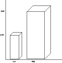
EXAMPLE 2.2.9 SOLUTION
In this case (unlike in the previous example), the vertical scale starts at 0, as it should.
Also, the heights of the two figures are drawn correctly to scale, since the column above "FEB" is
twice as high as the column above "JAN." What makes this graph misleading is that fact that Gomer is incorrectly using a three-dimensional object (a column in the shape of a rectangular solid) to represent a one-dimensional quantity.
Assume that the column above "JAN" correctly depicts sales for January.
Notice that the column above "FEB" is twice as high, twice as wide and twice as deep as the
column above "JAN." This means that the column above "FEB" is actually 8 times as large as the
column above "JAN."
If Gomer wanted to use three-dimensional objects like these to accurately depict the
relationship between January sales and February sales, then the second column could be twice
as high as the first, OR twice as wide as the first, OR twice as deep as the first, but it can't be
all of these things.
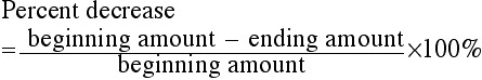
Percent increase or percent decrease
If a quantity increases or decreases, we can compute the percent increase or percent decrease.
Percent increase
If a quantity is increasing, we compute percent increase as follows:
![]()
This is the same as:
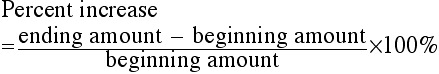
Percent decrease
If quantity is decreasing, we compute percent decrease as follows:
![]()
Which is the same as:
EXAMPLE 3.1.10
In July, Gomer had 12 pet wolverines and 10 fingers. In August, he had 15 pet wolverines and 8 fingers.
1. Find the percent increase in his wolverines.
A. 25%
B. 125%
C. 30%
D. 3%
2. Find the percent decrease in his fingers.
A. 80%
B. 180%
C. 20%
D. 120%
see solution
EXAMPLE 3.1.11
(The information in this example is factual, according to the Workers Rights Council.)
1. In a sweatshop in El Salvador, a seamstress is paid 74¢
for the labor required to sew one Liz Claiborne jacket (retail price: $198).
If she were to be paid a "living wage," her pay would for that job would increase to $2.64.
Find the percent increase in her pay if this were to happen.
2. Referring to the information in Part 1:
Suppose that the seamstress' pay is increased so that she receives a "living wage," and
suppose that the entire cost of this is passed on to the consumer.
Find the percent increase in the retail cost of the jacket.
see solution
EXAMPLE 3.1.12
(The information in this example is factual, according to the "Drug Wars Facts" by
Kendra Wright and Paul Lewin.)
After the enactment of mandatory minimum sentencing for federal drug offenders,
the annual budget for the Bureau of Prisons increased from $220 million (in 1986) to
$3.19 billion (in 1997). Find the percent increase.
see solution
Click here for a literary exploration involving percent increase.
PERCENTILE RANK
The percentile rank of a score in a distribution tells the
percent of scores that were less than the that score.
In this context, a "score" can be any quantity that can be sampled from a group or population, such as an organism's weight, a person's height, an animal's life span, a product's life span (that is, the amount of time from manufacture to failure), and so on.
For example, if we have a distribution of adult human males according to weight, and Frank's weight has a percentile rank of 30, then 30% of adult human males weigh less than Frank.
EXAMPLE 3.1.13
The information below refers to scores on a standardized exam.
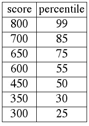
1. What percent of test-takers had scores that were less than 350?
2. What percent of test-takers had scores that were greater than or equal to 600?
3. Approximately what percent of test-takers had scores that were between 700 and 450?
EXAMPLE 3.1.13 SOLUTIONS
We must answer all three questions by referring to the definition of percentile rank
given above.
1. Since a score of 350 has a percentile rank of 30, the table tells us
directly that 30% of the test-takers had scores less than 350.
2. Since a score of 600 has a percentile rank of 55, the table
tells us directly that 55% of the test-takers had scores less than 600;
this means that the other 45% of test takers had scores greater than or equal
to 600 (because 100% - 55% = 45%).
3. Since a score of 700 has a percentile rank of 85, the table tells
us directly that 85% of the test-takers had scores less than 700; likewise,
the table tells us directly that 50% of the test takers had scores less than 450.
Now we subtract: 85% - 50% = 35%. Roughly 35% of the test-takers
had scores between 450 and 700. (This answer is approximate, because
these 35% actually include the test-takers whose scores were exactly 450.
The table does not provide enough information to permit us to answer
this question precisely; despite that flaw, this phraseology is used on the CLAST).
EXAMPLE 3.1.14
The table below gives an accurate portrayal of the distribution of humans according to IQ.
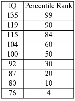
1. What percent of humans have IQs greater than or equal to119?
A. 90
B. 99
C. 9
D. 10
2. Approximately what percent of humans have IQs between 92 and 104?
A. 30
B. 50
C. 20
D. 10
3. What percent of humans have IQs less than 87?
A. 24
B. 20
C. 14
D. 10
see solution
What about "nth percentiles?"
Download practice exercises (PDF file)